Trend Analysis
Trend classification
Analyze trends colors each region outline (in the regional view) or each grid cell (in the global view) by the rate at which the displayed layer has been rising or falling. Trends are on when the app opens; click Hide trends to turn them off.
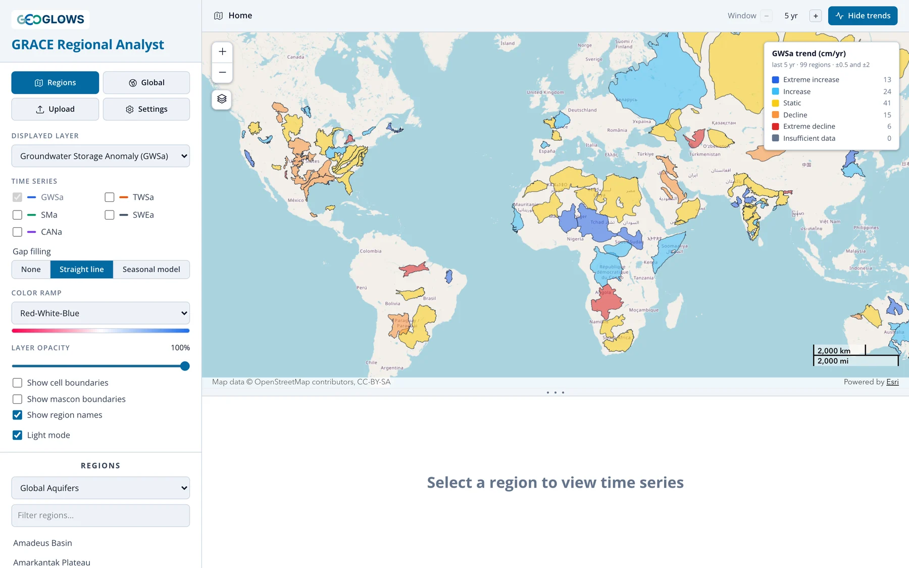
In the regional view, above, each aquifer or basin gets one trend from the average of its cells (see Regional View). That is the better guide for a particular aquifer.
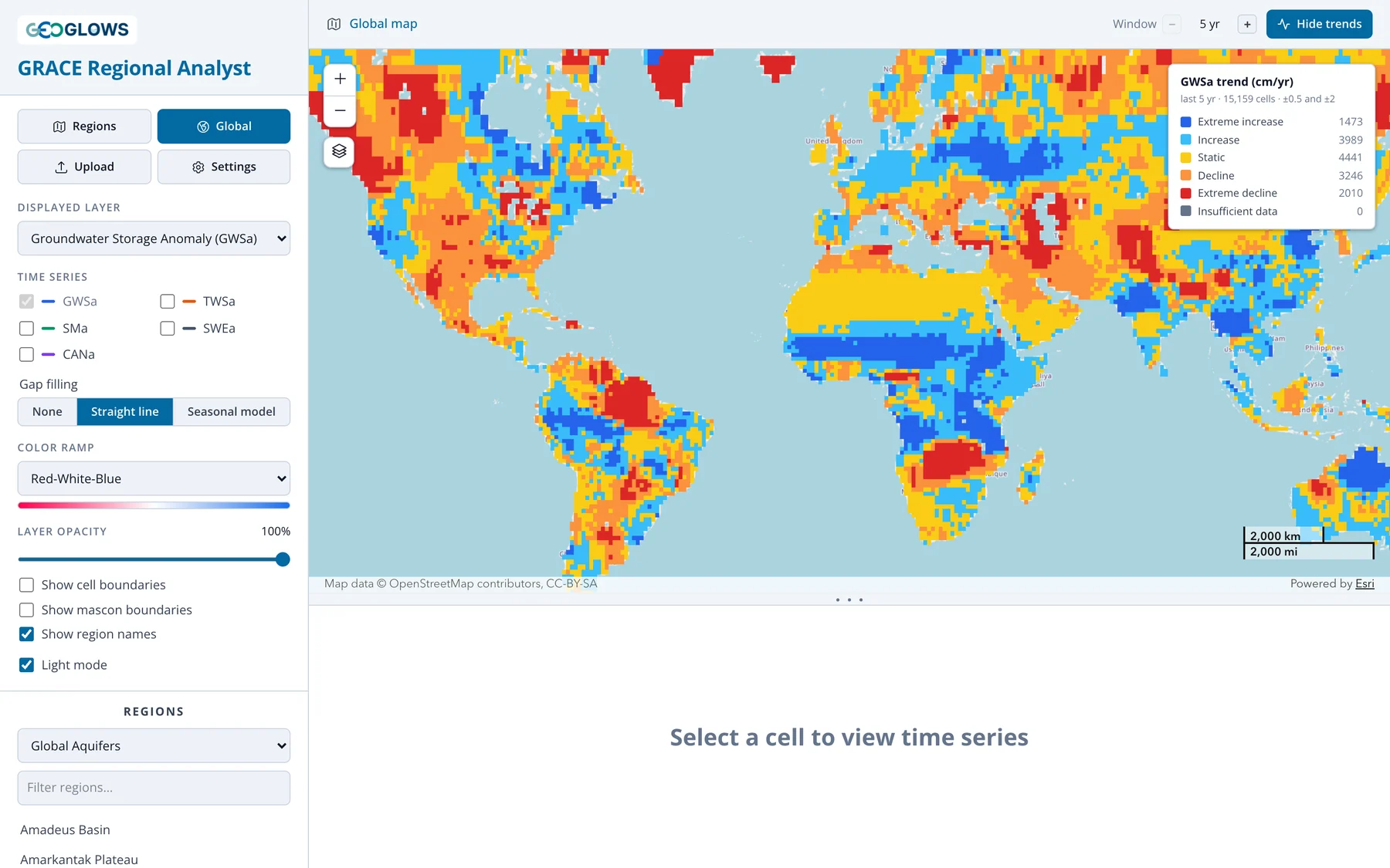
The global view, above, classifies all 15,159 land cells, so it shows where storage is changing regardless of aquifer boundaries: rising across the Sahel and East Africa, falling across much of the Middle East, northern India and Brazil.
The trend is the slope of a straight line fitted by least squares to the monthly values in the trend window, in cm per year. Months with no GRACE data are skipped, not filled. A region or cell needs at least 24 months with data in the window to be classified; otherwise it is shown as Insufficient data.
| Class | Trend (cm/yr) |
|---|---|
| Extreme decline | less than −2 |
| Decline | −2 to −0.5 |
| Static | −0.5 to +0.5 |
| Increase | +0.5 to +2 |
| Extreme increase | more than +2 |
The legend counts the regions or cells in each class. For reference, a trend of −2 cm/yr sustained over 100,000 km² is a loss of 2 km³ of water a year.
The trend window
The Window stepper in the header sets how far back the fit reaches from the most recent month: 5, 10, 15 or 20 years, or All for the whole record since 2002. The classification and the legend update when you change it.
Storage in most regions swings between wet and dry years, so a short window can capture one swing rather than the long-term direction. In California's Central Valley, groundwater storage declined from 2002 through the drought of 2021–2022, then recovered partly after the very wet winter of 2022–2023. The 5-year trend is an increase; the 20-year trend is a decline. Both are correct for their windows. Look at the time series before drawing conclusions from a trend class, and compare more than one window.
Trend line on the chart
When a region or cell is selected and trends are on, the chart adds the fitted line as a dashed line over the trend window, and the legend reports the slope, for example "GWSa trend +2.25 cm/yr (last 5 yr)". Each plotted component gets its own trend line.
How the region classification is computed
To classify every region in a set at once, the app averages the cells whose centers fall inside each region, weighted by the cosine of latitude. This is faster than the overlap-weighted average used for the chart of a selected region (see Regional View), and the two can differ slightly for small or narrow regions. The trend in the chart legend is the one computed from the chart's series. A region too small to contain any cell center is classified using the cell at its center.