GEOGloWS Hydroviewer (Web App)
This tutorial will show how to use the GEOGloWS ECMWF Streamflow Explorer App. Features include a forecast hydrograph for each stream, historically simulated streamflows, and the ability to download time series.
To open the app, please click here: http://apps.geoglows.org/apps/geoglows-hydroviewer/
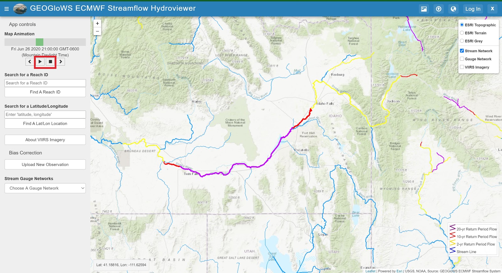
View the Animated Forecast
Zoom in on an area that looks interesting and explore the buttons on the left-hand side of the Hydroviewer.
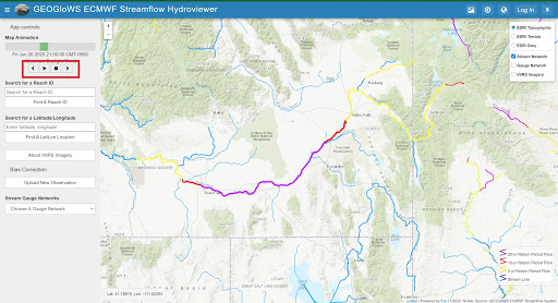
2. While examining the area, press the triangle “play” button on the left-hand side and notice how the thickness (discharge magnitude) and color (extreme event) can change. After examining for a few minutes push the square “stop” button.
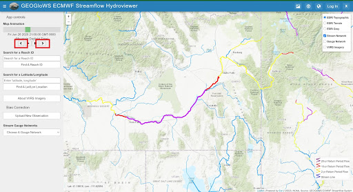
Next, use the two arrow buttons to toggle through and observe the changes of the forecast.
Locate a Stream by its ID
You can zoom in and select any stream you want (and feel free to explore) but in order to match other examples later follow these steps to locate a specific reach ID found in Colombia.
On the left panel under the animation control options enter 9004355 in the box for “Search for a Reach ID”
Then select the “Find a Reach ID”
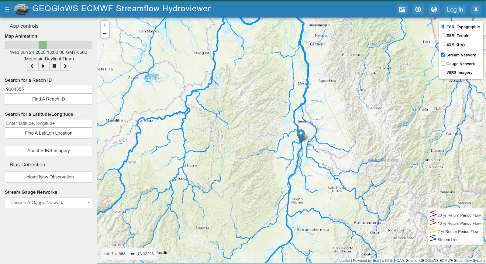
Now click on the stream nearest the pin (you may have to zoom in for better accuracy).
The current 10-day ensemble forecast is displayed in the plot window for the selected stream segment.
Visualize and Obtain Data
Choose a stream and click on it in order to pull up the data. On the top bar, there are five tabs that allow you to examine the forecast and simulated historical data for the selected stream.
Note
The Average Flows and Flow-Duration tabs will not be visible until you get the historical data from the second tab. This will be explained below.
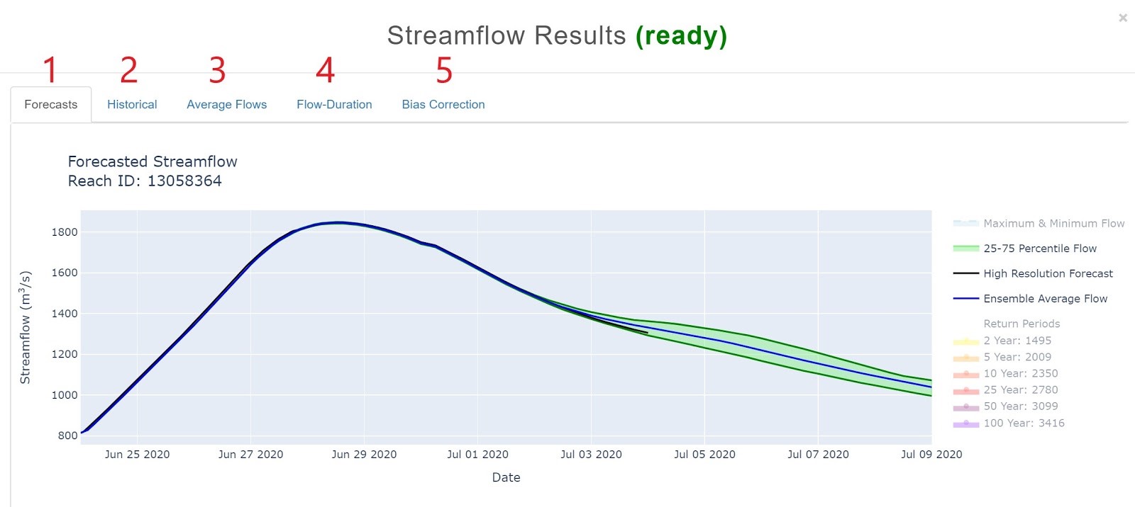
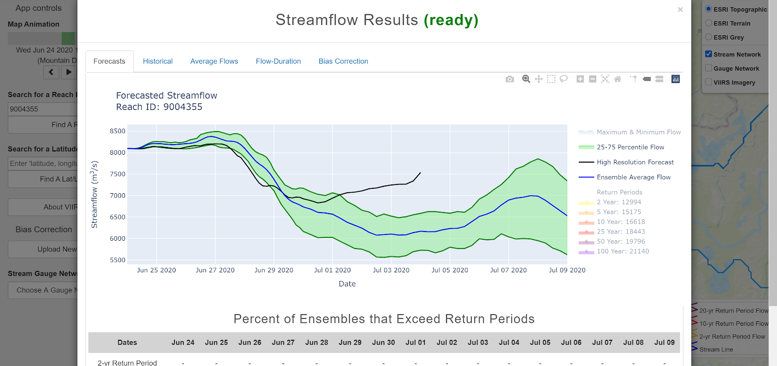
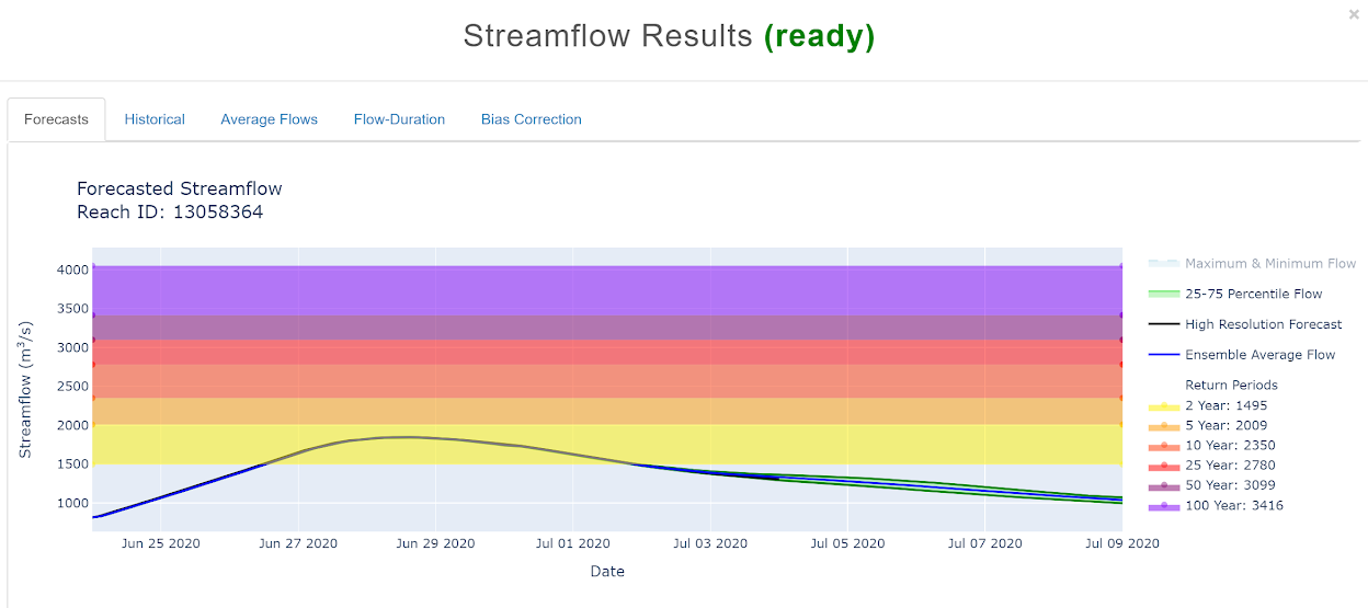
Forecasts
The forecast (as shown above) comes from 51 different simulations. The graph includes the average, the 25-75 percentile flows, the maximum and the minimum flows, and a single higher resolution forecast (black line - HRES).
The legend can be seen on the right, and the different layers can be turned on and off by double clicking on them in the legend. Experiment with turning on/off the display of each layer.
The actual streamflow value for each time period can be displayed by hovering the cursor over the graph.
The forecast also includes the return periods which are toggled on by default when the forecast exceeds a threshold (as seen below) but are off by default when they do not (shown in the figure above). The return period threshold values are displayed when hovering over them on the right edge of the graph.
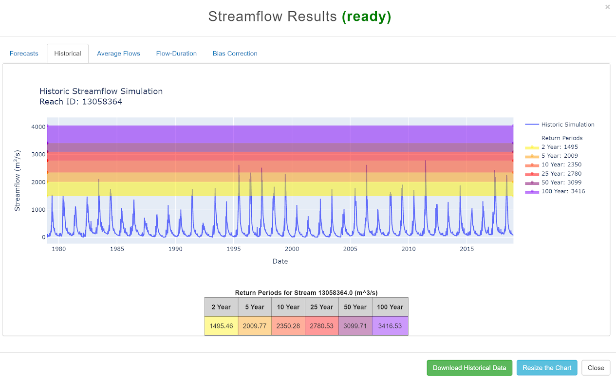
Historical
This is a graph of the 40-year simulated historical flow.
The different colors in the graph represent the different return periods which are computed from the 40-year historical simulation and Gumbel Method.
A table displaying the threshold values is included below the graph.
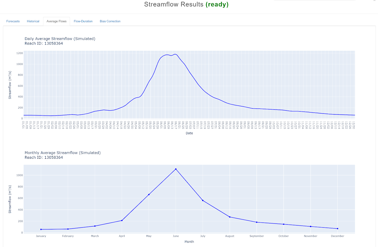
Daily/Monthly Average
Daily and Monthly Average Streamflow are calculated from the historical simulation.
These tabs will pop up on the top after you click “Get Historical Data” on the Historical tab.
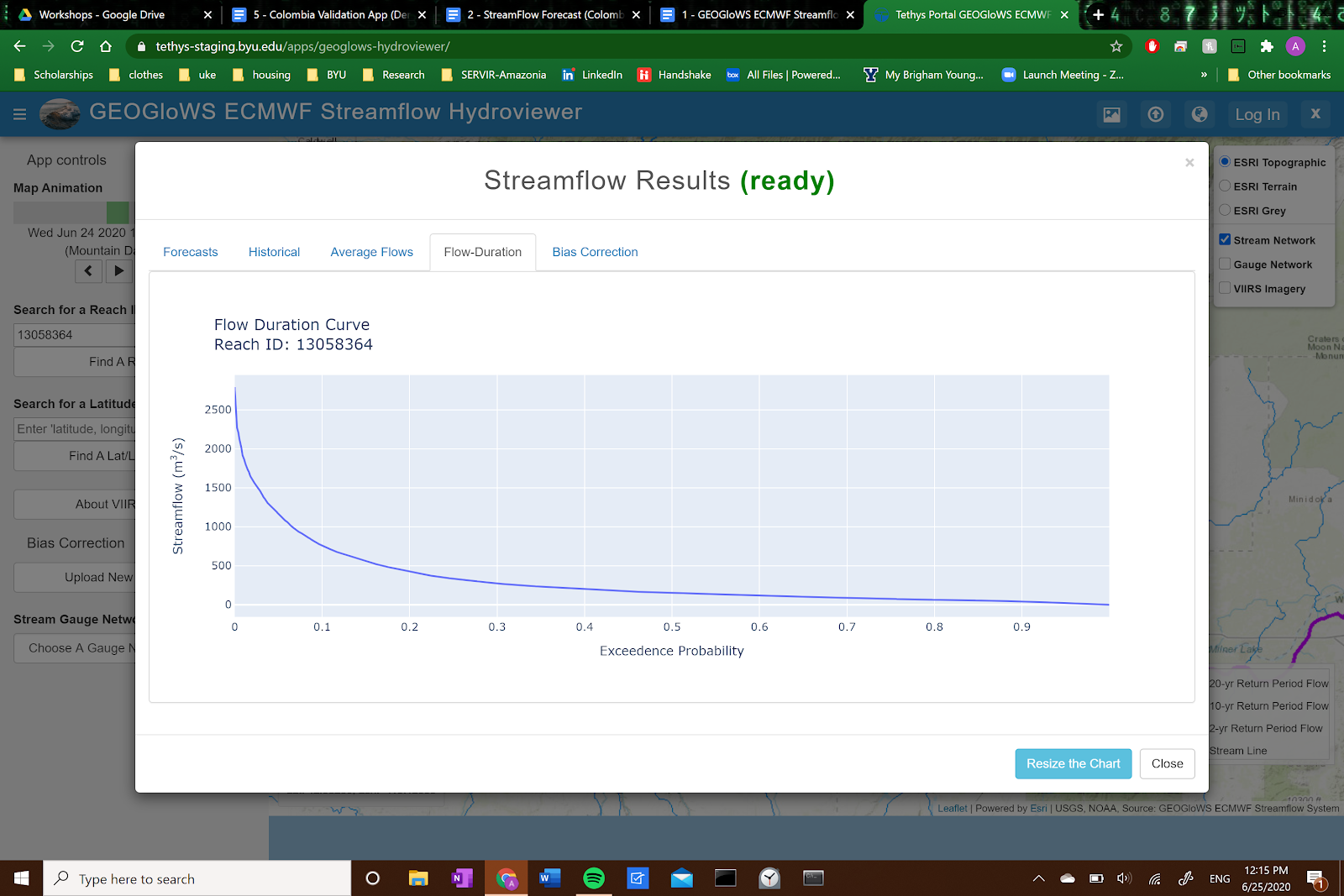
Flow-Duration
This plot shows the probability that the streamflow will be greater than any given value.