Using the RFS Hydroviewer
The RFS Hydroviewer is a tool for visualizing and accessing streamflow forecasts and historical data across the globe. This web-based application allows users to explore real-time streamflow conditions, analyze forecast trends, and review hydrological simulations for any river, helping decision-makers and researchers better understand water-related challenges. With easy-to-use visualization tools, users can assess discharge values and identify potential flood or drought risks. The HydroViewer supports informed decision-making in water resource management, disaster risk reduction, and climate resilience planning. Access the app at RFS Hydroviewer.
Stream Visualization
The Hydroviewer highlights streams where flows are expected to exceed return periods, using the following color-coded legend:
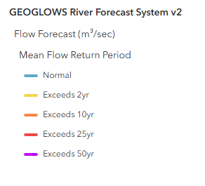
This allows users to quickly identify rivers experiencing high flows.
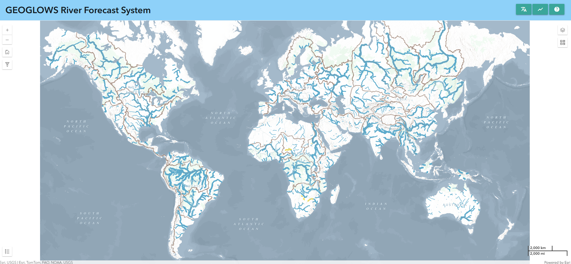
Map Features:
- Zoom Levels:
- At the global level, only the largest streams are displayed.
- As users zoom in, more streams become visible within their area of interest.
- Interactive River Selection:
- Clicking on a river displays retrospective and forecast data for that stream.
- The river ID is shown for easy reference.
- Direct River ID Entry:
- If the river ID is known, users can directly enter it into the application to view the data.
Users can download plots and .csv files for streams of interest.
Selecting Data
At the global level, only the largest streams are shown. More streams become visible as a user zooms in on the map and their area of interest. If you are not accurate enough in your click, a warning will show asking you to zoom in more and be more precise when clicking the river segment.
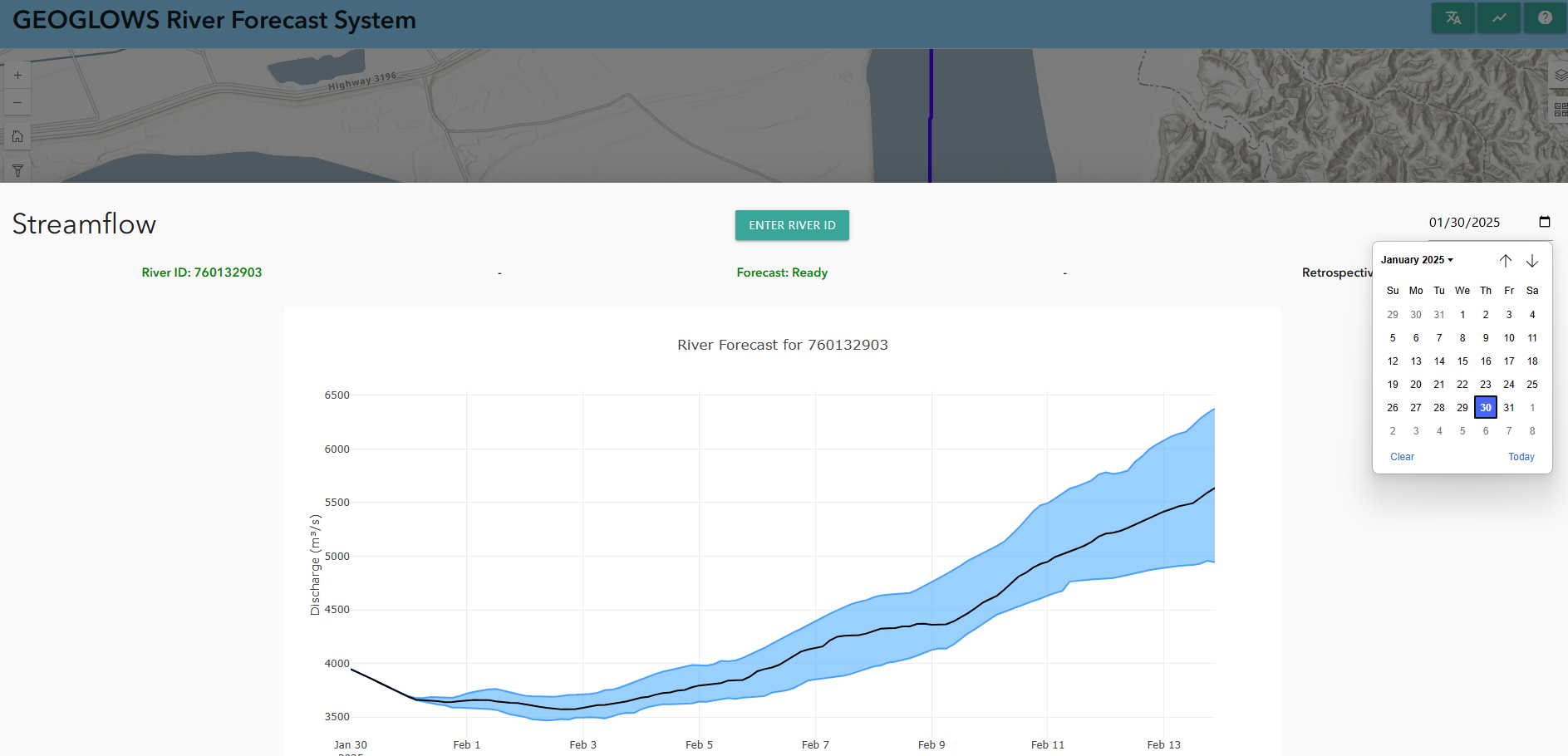
Once you have selected the streams, a pop-up window will appear with the river name, ID, and the forecast data with its accompanying graph. More on this graph is explained at Forecast Data.
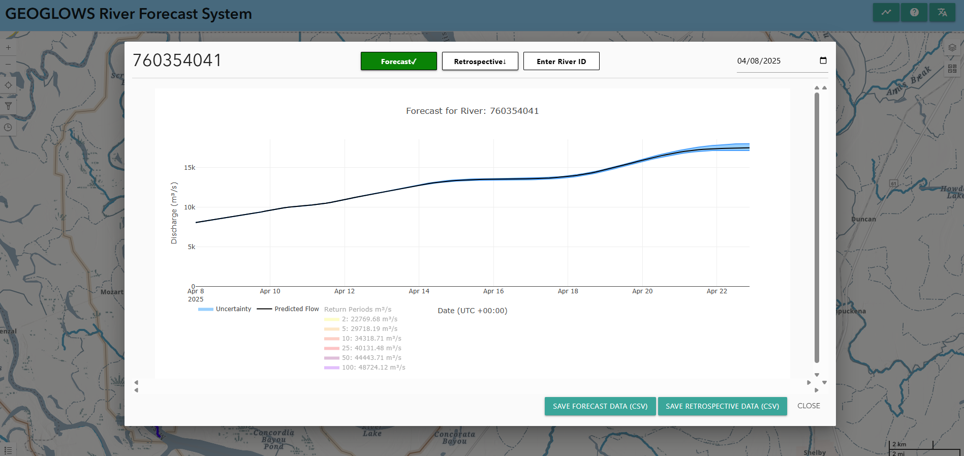
Plots and .csv files can be downloaded for streams of interest by selecting the camera icon in the corner of the plot.
Previous Forecast Data
By default, when you click on a stream, the 15-day forecast from the current day will be displayed. However, if you would like, you can see a forecast from a previous day by choosing a date from the date dropdown menu.
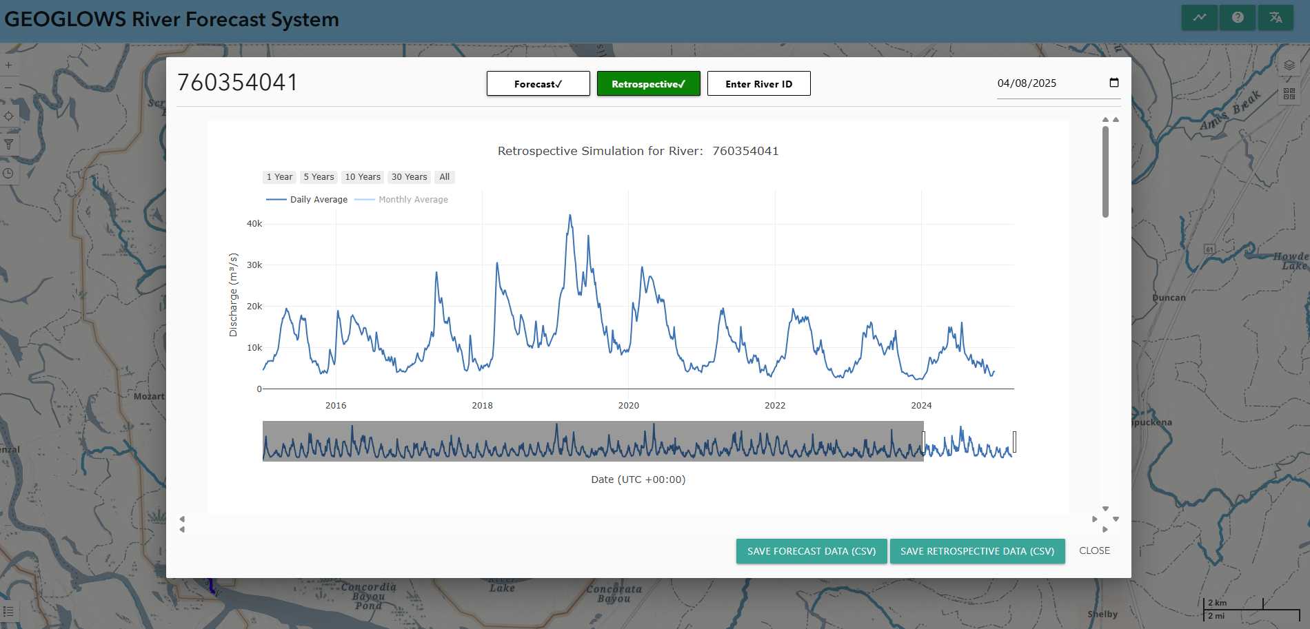
Retrospective Data
You can view the retrospective data by switching to retrospective view at the top of the pop-up window. The highlighted blue icon shows whether you are viewing the forecast or the retrospective data. By default, you will view 10 years of retrospective data, but this can be adjusted using the grey sliders at the bottom. The entire retrospective dataset, dating back to 1940, can be accessed this way.
There are several other graphs with information about the retrospective data that you can view as you scroll down in the pop-up window. This data is all based on the values from the retrospective data and then are calculations performed using that data.
Yearly Cumulative Discharge
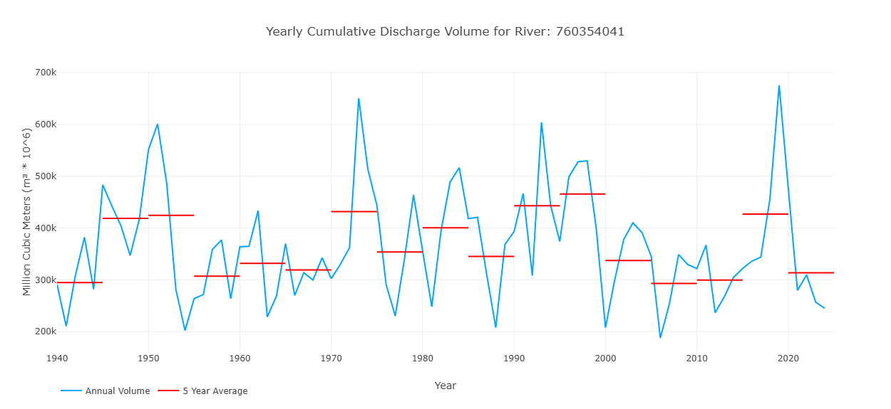
This graph shows one value for each yeat in the retrospective simulation, representing the total discharge volume over that year for that stream. This is represented by the blue line on the graph. The red lines show 5 year averages of the volume to represent how the volume in the stream may be changing over time.
Flow Regime Graph
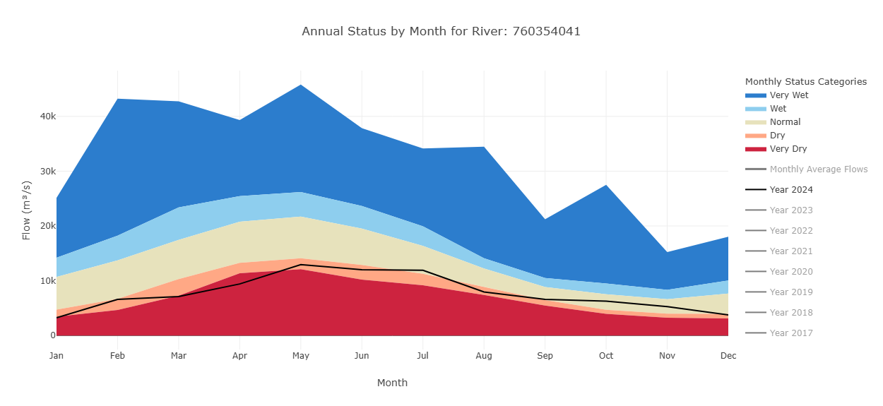
This graph shows the range of streamflow conditions—very dry, dry, normal, wet, and very wet—throughout the year. It is based on methods developed by the WMO for their HydroSOS initiative. The category ranges are calculated using historical monthly averages. Each month's values are ranked separately and assigned a percentile. These percentiles are then used to define the thresholds for each category.
The colors on the graph represent these categories for each month. Users can select the years they want to view, with the most recent year shown by default. The monthly averages for the selected year(s) are plotted on top of the background colors, allowing users to visually compare current or past streamflow to historical norms.
This graph helps users understand how river flow values in a given year compare to what is considered normal, and whether conditions were wetter or drier than usual for each month.
Flow Duration Curves
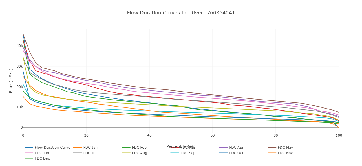
This graph displays streamflow on the y-axis and exceedance probability on the x-axis. Each point represents a monthly flow value, showing how often that level of flow is exceeded. In addition to the individual monthly values, the graph includes an overall flow duration curve based on the entire dataset. This allows users to compare monthly flow patterns with the long-term distribution of flows.
Entering a River ID
If a user already knows the river ID for their stream of interest, they can directly enter the river ID into the application to view the data.
- Get the chart pop-up window open either by selecting the chart icon in the upper right corner or by it being open from a previous river selection.
- Click on “Enter River ID” on the top of the pop-up window.
- Type in any river ID (for example, this reach ID is for the Magdalena River in Colombia:
610363879) and click “OK”. - The forecast and retrospective data will reload and will be displayed for the new river in the pop-up window.
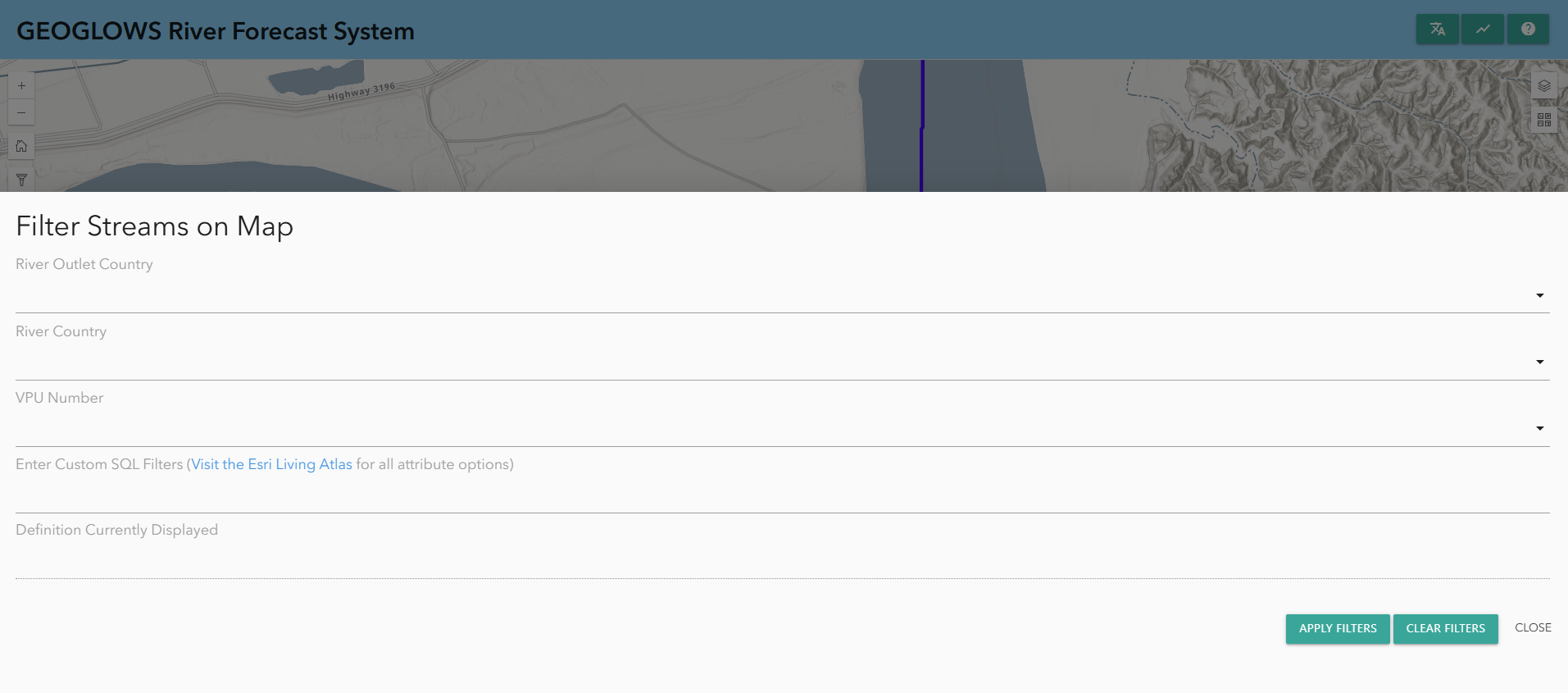
Filtering Data
Data can also be filtered:
- Click on the filter button on the left-hand side to bring up the filtering options.
- There, you will find options to filter based on:
- River country
- VPU number
- River outlet country
This will only show rivers that meet these criteria on the map.